Floyka® Design Studio
000
Case study · (02)

RlayHub

ClientRlayHub
Year2026
SectorWeb3 · Education · Community · Events
ServicesBrand Identity, Logo & Type, Visual Language, Event Branding
RlayHub

(A) Overview

RlayHub is an independent learning and gathering space for young people who want to become active producers in the fast-changing world of technology. Built around blockchain, crypto assets, artificial intelligence, and finance, it focuses on accessible, in-depth, and practice-based education.

(B) Challenge

RlayHub needed a visual identity that could carry the weight of a serious educational mission while remaining approachable and energising for a young, technically curious audience. The brand had to work across camps, workshops, community events, and digital platforms simultaneously.

(C) Approach

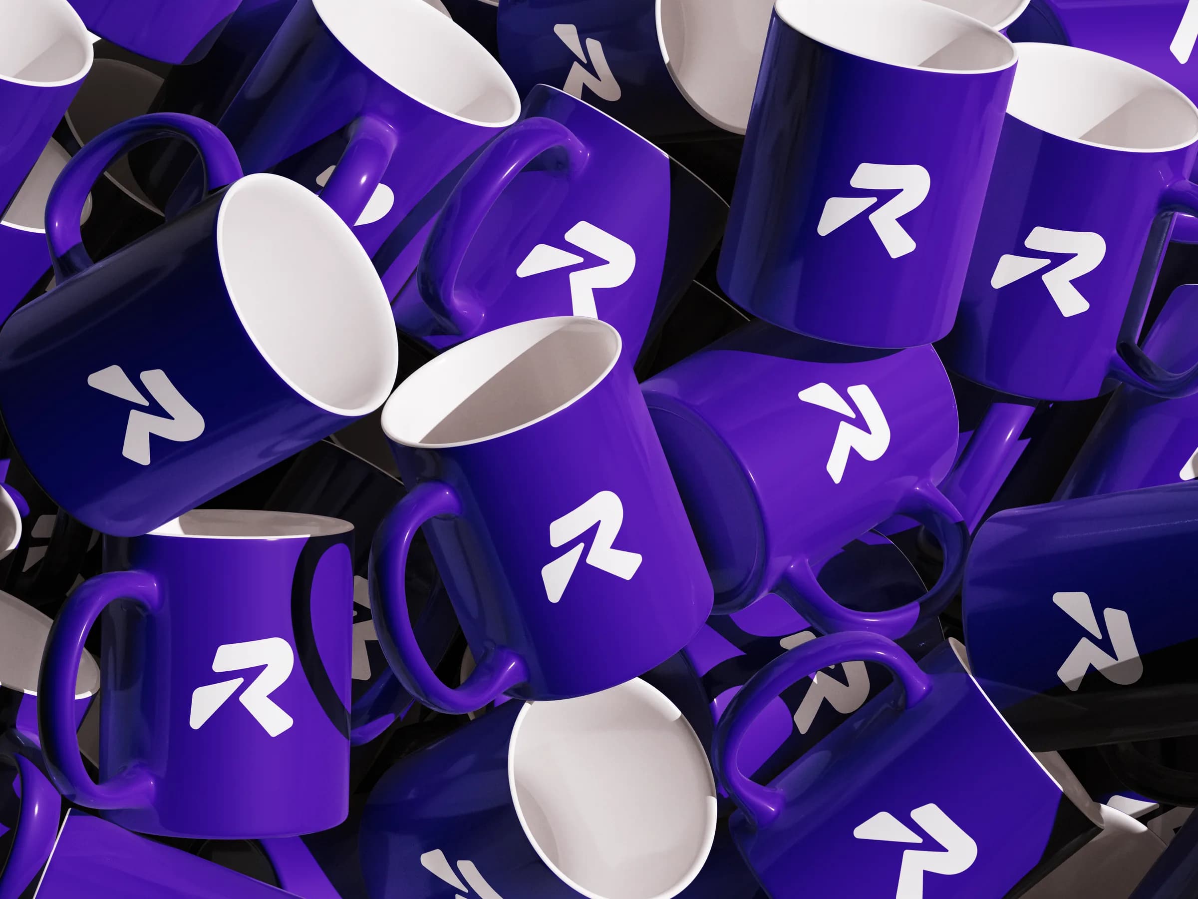
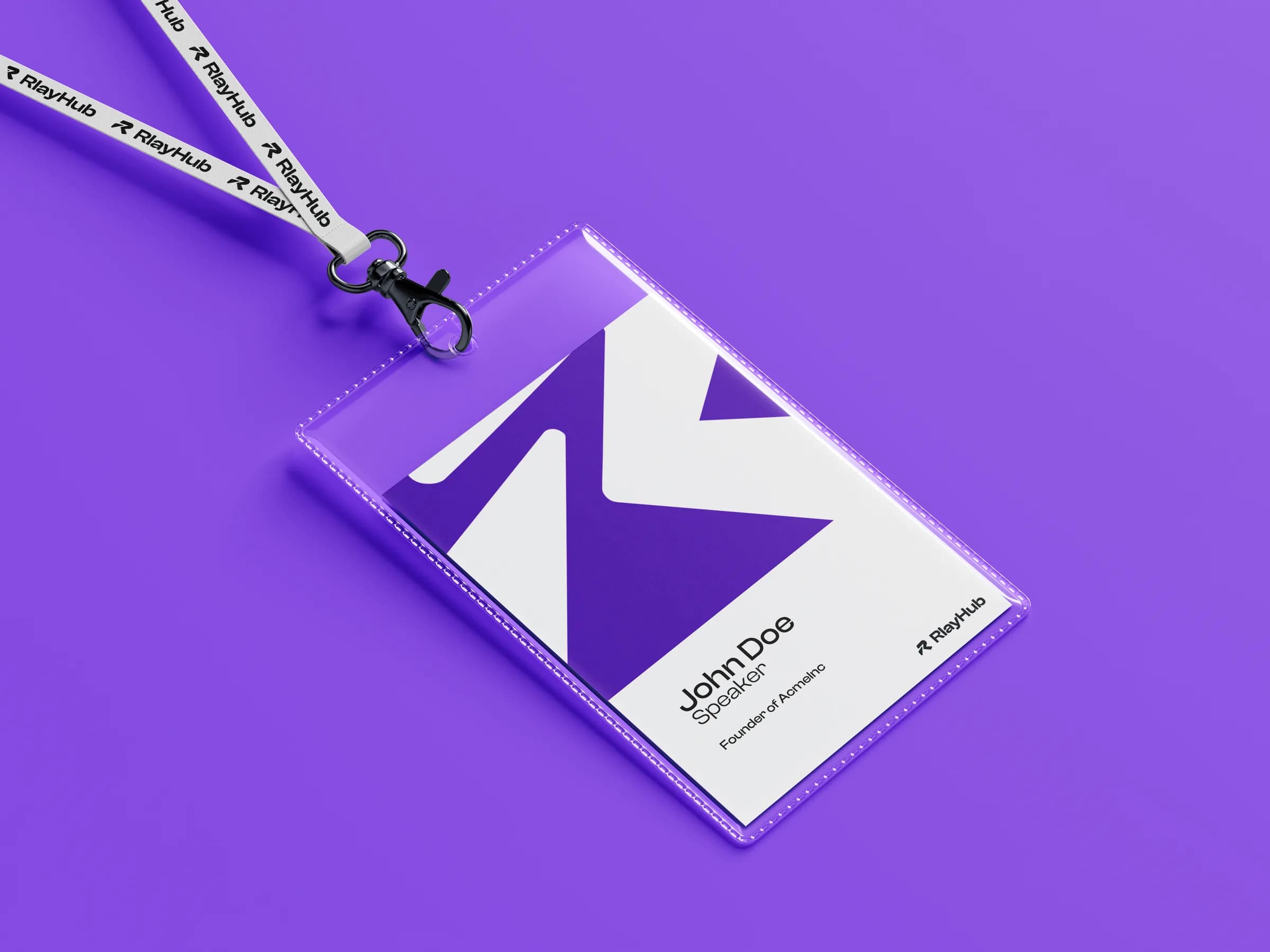
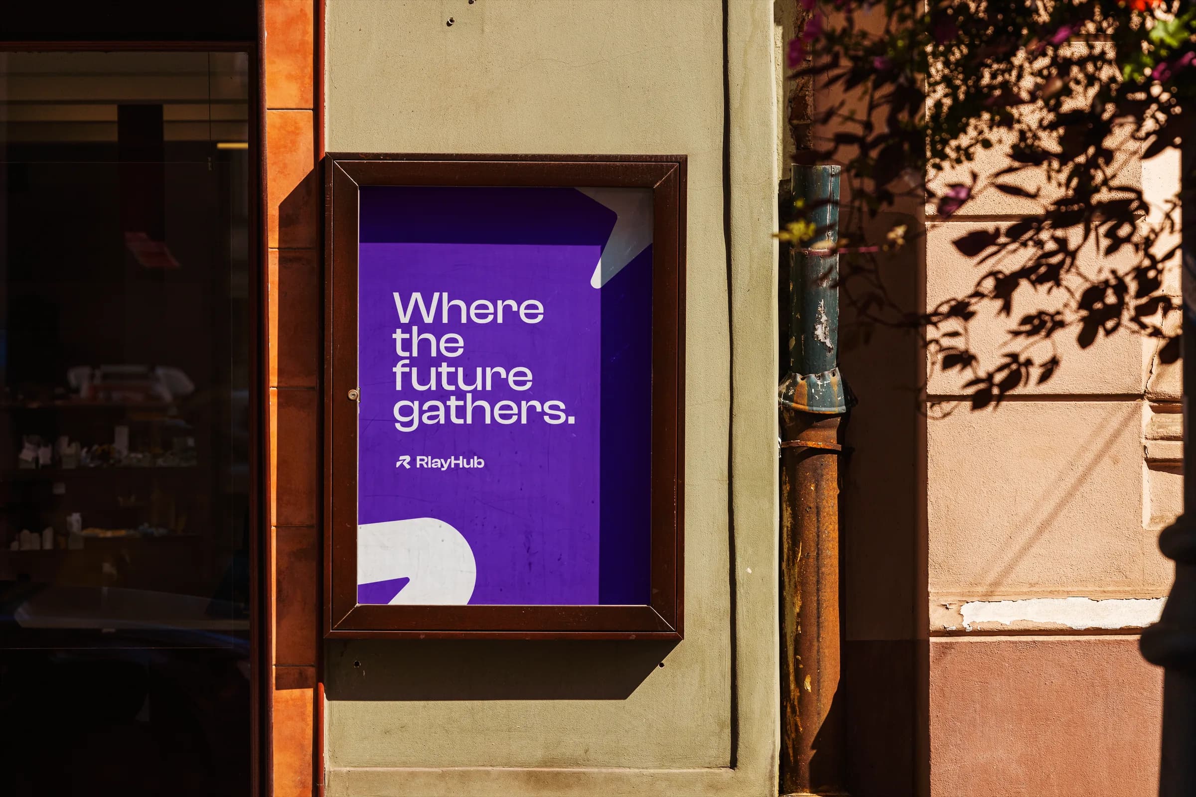
We led a full branding process from the ground up: naming the visual system, defining the typographic and colour logic, crafting a logomark and combination mark that communicate precision and community, and building out mockups that showed the identity in the real world.

(D) Outcome

The resulting brand system gives RlayHub a distinctive, confident presence in the Web3 education space, one that scales from a social media post to a stage backdrop without losing its character.

(E) Brand Guidelines

Logomark Colourways

The mark ships in three locked colourways, one for each ground it is allowed to sit on. Brand purple on the light surface, white on the dark one, white on brand purple. Nothing else is approved, and the mark is never recoloured to match a photograph or a partner palette.

Which one to reach for is a contrast decision, not a taste one: pick the version that keeps the counters of the R open at small sizes. On the brand ground the white cut is the only one that holds; the purple-on-purple version does not exist for a reason.

The R is cut from two pieces with a gap between them. That gap is the first thing to close when the mark is scaled down or placed on a busy surface, which is why the colourways are drawn on a filled square rather than supplied loose.

Brand purple
#560BAD
Dark surface
#000814
Light surface
#F8F9FA
RlayHub logomark in brand purple on the light surface
Brand on light
RlayHub logomark in white on the dark surface
White on dark
RlayHub logomark in white on brand purple
White on brand

Colour

Five colours carry the system. Main Black and Main White do the structural work, and three accents sit on top of them: Deep Rlay Purple as the brand colour, with Vivid Raspberry and Coral Orange behind it for the moments purple alone cannot separate.

Every accent ships with a muted partner. The saturated tone is for the thing being pointed at, the muted one is for the surface it sits on, which is what stops a schedule of ten sessions from reading as ten alerts.

The two neutrals also ship as full 50 to 900 ramps, so a border, a divider and a disabled state all come out of the same family instead of being mixed by eye. The strip under each accent is its core and muted pair; under the neutrals it is a sample of the ramp.

Core colours
5
Muted partners
3
Neutral ramps
50 to 900
Deep Rlay Purple#560BADRGB 86 / 11 / 173
Vivid Raspberry#FF1654RGB 255 / 22 / 84
Coral Orange#FF6B35RGB 255 / 107 / 53
Main Black#000814RGB 0 / 8 / 20
Main White#F8F9FARGB 248 / 249 / 250

Motion

The reveal draws the mark rather than moving it. The two cut pieces of the R are struck in sequence and the wordmark settles under them, so the animation explains how the logo is built instead of decorating it.

It runs 3.4 seconds and resolves to the static lockup, which means the final frame is a usable still for an end card, a loading state or a stage backdrop between sessions.

Both treatments ship together and follow the same contrast rule as the static mark: purple on the light cut, all white on the dark one. Transparent masters (ProRes and WebM alpha) come with the kit for anyone compositing over their own background.

Duration
3.4 s / 102 frames
Master
1920 x 1080, 30 fps
Grounds
Light, dark, brand, alpha
Purple mark, light ground
White mark, dark ground

Social Headers

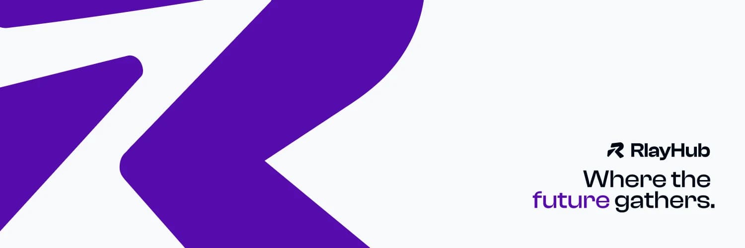
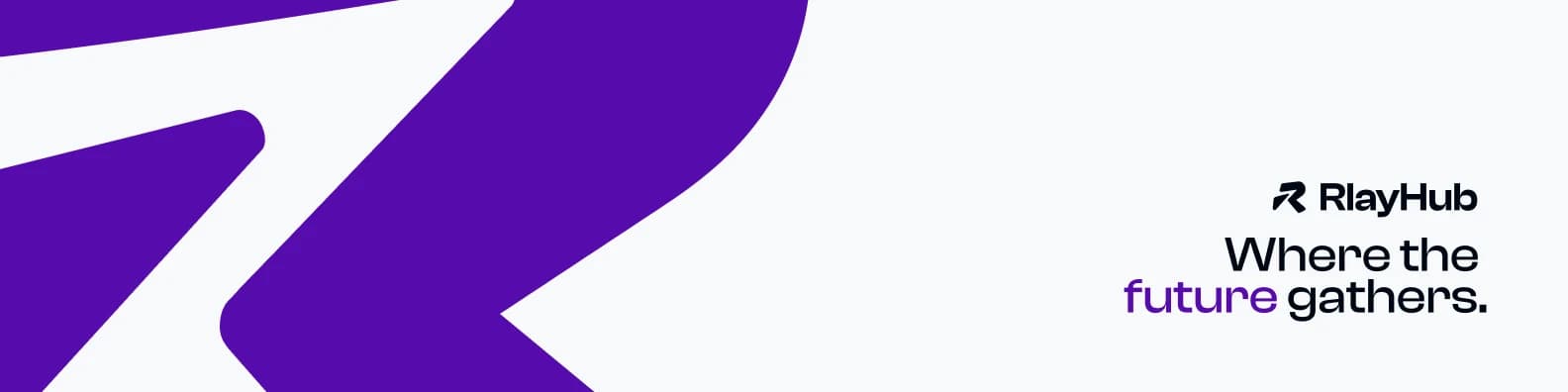
The header formats are where the mark gets to be a shape rather than a logo. Cropped past the frame it stops reading as an R and becomes the field the copy sits on, which is the one place the identity is allowed to run at that size.

The lockup and the line stay on the light surface on the right, clear of the crop, so they survive the profile picture that punches into the lower left of both platforms. “future” picks up brand purple; the rest of the line stays black.

Two ratios ship because the platforms crop differently: 1500 x 500 for X, 1584 x 396 for LinkedIn. Same artwork, reframed rather than rescaled, so the mark is cut at the same weight in both.

X header
1500 x 500
LinkedIn cover
1584 x 396
Safe area
Right third
RlayHub X header with the mark cropped past the frame
X header
RlayHub LinkedIn cover with the mark cropped past the frame
LinkedIn cover
Full
Brand identity system
2026
Project year
Web3
Education sector
Next project · (03)

ODTÜ Blockchain Days 2026 ↗︎