Floyka® Design Studio
000
Case study · (01)

SOCI4L

ClientSOCI4L
Year2026
SectorWeb3 · Identity & Social
ServicesBrand Identity, Logo & Type, Visual Language, Asset Kits
SOCI4L

(A) Overview

SOCI4L is an Avalanche-native identity layer: it turns a wallet address into a public, human-readable profile with a reputation score built from what that wallet has actually done on-chain. Started during the Avalanche Build Games and now live on mainnet. We designed the brand from the mark up, then packaged it so it could travel onto surfaces the product does not control.

(B) Challenge

A profile product has to satisfy two audiences that pull in opposite directions. To Avalanche builders wiring it into their apps, it has to read as credible infrastructure. To the person pinning it in an X bio, it has to read as a page worth sharing. On top of that, the identity rarely appears on home turf: it shows up embedded in someone's CV site, as a badge on a partner dashboard, inside a Chrome extension overlay, on a QR code on a conference slide. It had to hold at badge size, next to other people's branding, in both light and dark.

(C) Approach

We built a token system rather than a logo file. A geometric mark cut from four chamfered blocks, drawn to stay legible from favicon to stage screen, paired with a wordmark where the 4 carries the whole personality. Geist and Geist Mono split the labour: mono for addresses, scores and system labels, sans for everything a human reads. One brand blue on a strictly monochrome base, with a full 50 to 950 ramp and matched light and dark surface tokens, so every screen resolves from the same source. Then we packaged the identity: icon, wordmark and combination lockups in black and white, a Powered by SOCI4L badge set, social headers, and a public community kit.

(D) Outcome

SOCI4L shipped on Avalanche mainnet with one identity holding across the product, the documentation site, the Chrome extension, the embeddable profile widget and third-party sites carrying the Powered by badge. Because the kit is public, anyone integrating SOCI4L can use the brand correctly without having to request files.

(E) Brand Guidelines

Clear Space and Minimum Size

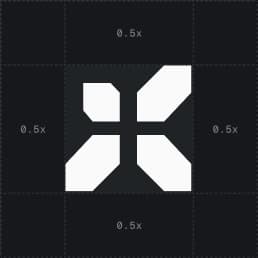
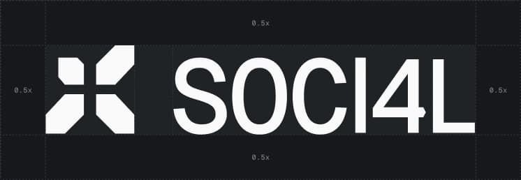
Keep a minimum clear space around the logo so it never competes with surrounding elements. That space is 0.5x on every side, where x is the height of the icon, so a framed mark measures exactly 2x.

No other graphic element, typography, or container edge may enter this zone. On busy or photographic backgrounds, increase the clear space rather than shrinking the mark.

SOCI4L mostly appears on surfaces the brand does not control: embedded widgets, partner dashboards, extension overlays. The minimum sizes are the point at which the 4 stops resolving. Do not go under them.

Clear space
0.5x, all sides
Minimum digital
24 px / 120 px
Minimum print
8 mm / 34 mm
SOCI4L icon clear space diagram
Icon
SOCI4L combination mark clear space diagram
Combination mark

Colour

Three colours carry the whole system. A near-black surface and a near-white one do the structural work, and a single blue does all the signalling.

Brand Blue is deliberately scarce. It marks a special action or a highlight and nothing else, which is what keeps it meaning something when it does appear.

The strip under each swatch is the real ramp that ships in the product, so a value picked here matches a token in the code rather than an approximation of it.

Core colours
3
Primary scale
50 to 950
Blue usage
Highlights only
Brand Blue#2845D6RGB 40 / 69 / 214
Dark Surface#0A0A0ARGB 10 / 10 / 10
Light Surface#F0F0F0RGB 240 / 240 / 240

Typography

Two faces from the same family, split by what the text is rather than how it should look. Geist Sans carries everything a person reads: headlines, interface copy, marketing.

Geist Mono carries everything a machine produced: wallet addresses, transaction hashes, reputation scores, timestamps. Fixed advance width means a truncated address holds the same width wherever it appears, and a column of scores lines up on the digit.

Headings run SemiBold with tight tracking, body runs Regular, and Bold is kept for emphasis inside a line rather than for whole headlines. Three weights across the whole product.

The ramp is short on purpose. Six steps cover a dashboard, a public profile, a documentation page and an embedded widget, so a component dropped into a partner surface inherits a size that already exists rather than inventing one.

Primary
Geist Sans
Monospace
Geist Mono
Weights
Medium 500 / Bold 700
Aa
Geist SansHeadlines, UI text, clear communication

The quick brown fox jumps over the lazy dog.

Medium 500SemiBold 600Bold 700
Aa
Geist MonoCode blocks, data display, technical detail

0x71C7…9F2b · 0123456789

Medium 500Bold 700
H1 Display
Geist Sans30 / 36 pxSemiBold 600
H2 Section
Geist Sans24 / 30 pxSemiBold 600
H3 Title
Geist Sans20 pxSemiBold 600
Body
Geist Sans16 pxRegular 400
Subtext
Geist Sans14 pxRegular 400
Data
Geist Mono13 pxMedium 500

Motion

The logo animates on one idea: the four blocks of the mark arrive separately and lock into place. Nothing spins, nothing bounces. The mark is built from cut geometry, so the motion is assembly rather than decoration.

It runs a little over four seconds and resolves to the static lockup, which means the last frame is always a usable still. That matters for a video end card or a loading state, where the animation has to stop somewhere legible.

Every animation ships in both treatments. The dark cut carries a light mark, the light cut inverts it, and the choice follows the same contrast rule as the static logo. Add landscape, square and vertical crops and a gradient finish, and a placement never needs a reframe or a recolour of the source file.

Duration
4.05 s
Master
1920 x 1080
Variants
3 crops, 3 finishes
Combination mark, black, landscape
Combination mark, white, landscape

Iconography

The interface runs on Lucide, drawn on a 24 by 24 grid with rounded caps and joins. It is an open set, which matters for a product other people embed: an integrator can pull the same icons without a licence conversation.

Stroke stays at 1.5. Lucide ships at 2 by default, which reads heavy next to Geist at interface sizes, so the whole product steps it down and never mixes the two weights on one screen.

Sizes come from a short ladder rather than case by case. 16 is the default and does most of the work, 12 sits inside dense rows and badges, 20 marks a primary action, and 32 is reserved for empty states and feature blocks.

Icons inherit text colour and never carry their own. That is what lets the same file sit inside a button, a status pill, or an unfamiliar partner surface without anyone editing it.

Set
Lucide, 24 grid
Stroke
1.5
Sizes
12 / 16 / 20 / 32 px
Continue
Outbound
Confirmed
Verified
Search
Copy
Dismiss
Expand
Share
Links
Views
Recent
Followers
Wallet
Premium
Collapse
Sync
QR
Private
Activity
Follow
Download
Open
Stack
Growth
Dashboard
Info
Complete
Mainnet
Shipped on Avalanche C-Chain
3
Logo lockups, light + dark
1
Token system, product to partner sites
Next project · (02)

ODTÜ Blockchain Days 2026 ↗︎